Use UI Control Tags
UI Control Tags are structured blocks that can be used while creating a custom action template to display interactive UI components such as background color, text color, title text, and other input fields, etc. on the action templates. When a user selects an action template during experience creation, the action templates provide these UI components that allow them to provide appropriate inputs.
For each type of action template, the UI supports inserting "?{supported_value}" while building the action templates. You can either use these tags directly in the appropriate text boxes or as HTML codes. This section lists the supported tags.
| UI CONTROL TAG | DESCRIPTION |
|---|---|
| ?{z1_contenttext} | Use this tag in the HTML code editor or in the text box. Provides options to select from a list of predefined content or provide custom content. |
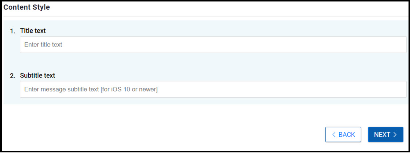
| ?{title} | Displays the Message Title field that allows the user to enter title text for the App Box Messages. Displays a Title text text box on the Push Notification template. |
| ?{backgroundcolor} | Displays the Banner Background Color field that allows the user to choose the background color from a palette or provide hexadecimal color value. |
| ?{fontcolor} | Displays the Banner Text Color field that allows the user to choose the text font color from a palette or provide hexadecimal color value. |
| ?{z1_tags} | Displays Match Tag(s) drop-down list that allows the user to select multiple attributes that provide matching tag content. In the case of ?{z1_tags}, the user can provide multiple tag lists. To display the first tag list, the user should insert ?{z1_tags, 0}, and for the second tag list, the user should insert ?{z1_tags, 1}, and so on. |
| ?{url} | Displays the REST Url field that allows the user to enter the REST endpoint URL. |
| ?{header} | Displays the REST Request Header field that allows the user to enter the request header in JSON. |
| ?{payload} | Displays the REST Request Payload field that allows the user to enter the request payload in JSON. |
| ?{subject} | Displays the Subject Text field that allows the user to enter the email subject text. |
| ?{template} | Displays the Template Name field that allows the user to enter the name of the email template. This tag only supports Adobe's email. |
| ?{templateAttr} | Displays the Template Attributes field that allows the user to enter the template's attributes. Enter a comma-separated list of template attributes in name and value pair. For example, attr1:val1. This tag only supports Adobe's email. |
| ?{z1_image} | Displays the Image List field. You can provide an image URL or click the image icon to browse the images. In the case of ?{z1_image}, the user can provide multiple images. To use the first image, the user should insert ?{z1_image, 0}, and for the second image, the user should insert ?{z1_image, 1}, and so on. |
| ?{subtitle} | Displays a Subtitle text text box on the Push Notification template. |
The following describes two examples - Banner and Push Notification.
Example 1 - Banners
This section provides sample UI control tags used to create Banner templates.
SAMPLE USAGE
Provide the below HTML snippet in the code editor:
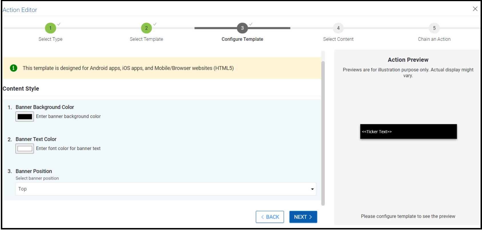
- For content, background color and font color field.
<div class="z1_b_box z1_b_box_style" style="background: ?{backgroundcolor};"><div class="z1_b_c2"><div class="z1_b_c2_1" style="color: ?{fontcolor};">?{z1_contenttext}</div></div></div> - For tag drop-down lists.
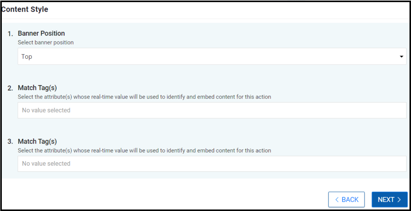
<div class=\"z1_b_box z1_b_box_style\"><div class=\"z1_b_c2\"><div class=\"z1_b_c2_1\" >?{z1_tags,0}</div><div class=\"z1_b_c2_1\" >?{z1_tags,1}</div></div></div>
OUTPUT
Displays the following UI components on the Action Editor window when this action is selected during experience instantiation to collect inputs from users.
- For content, background color and font color field.
- For tag drop-down lists.
Example 2 - Push Notifications
This section describes sample UI control tags used to create Push Notification templates.
SAMPLE USAGE
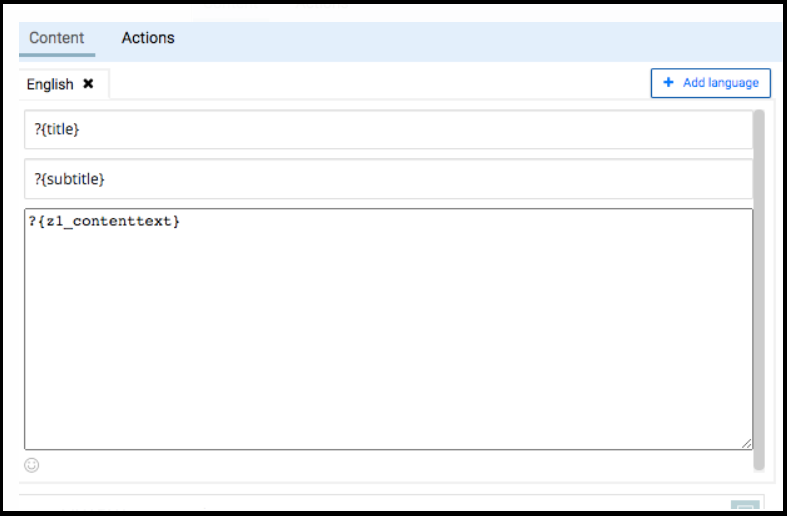
Provide the following tags while creating a Push Notification action template:
OUTPUT
Displays the following input fields on the Action Editor window when this action is selected during experience instantiation to collect inputs from users.
Updated about 1 year ago