Creating and Designing Charts
Session AI allows you to create Charts and use these charts to display Dashboards using the data captured.
- Charts: A chart is a sheet of information in the form of a table, graph, or diagram. Session AI charts are created using Data Sheets. These data sheets execute a cube or call an ad-hoc query to fetch data and draw the chart.
- Dashboards: A dashboard is like a page or a panel that displays one or more charts and other display controls.
NoteFor more information about cubes, cube queries and ad-hoc queries, refer the following sections:
Design Charts
Session AI allows you to create charts and use these charts to build dashboards. A chart inside a dashboard is represented by a chart control that is associated with a datasheet. Datasheets are used to send queries to the backend, get the data, and draw the charts. Solutions Developers can create a chart using the following two approaches.
- Chart Designer Mode: Select an out-of-the-box ad-hoc query or your custom query to create charts.
- Chart Advanced Mode: This allows you to use a JSON definition file that defines the chart. The JSON definition file is also known as a Datasheet in the C3 Console. It retrieves data from ad-hoc query or cube and renders the data on the chart.
Chart Designer Mode
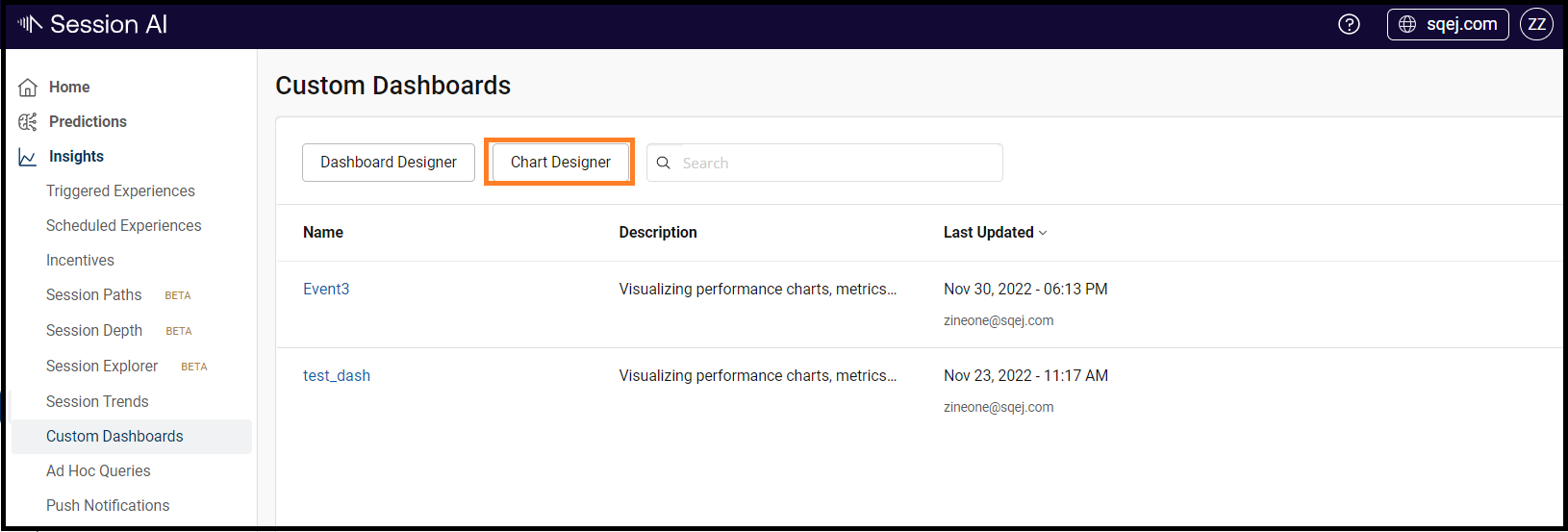
- In the Insights menu, click the Custom Dashboards tab.
The Custom Dashboards screen displays all the existing dashboards. - To create a new chart designer, click Chart Designer.
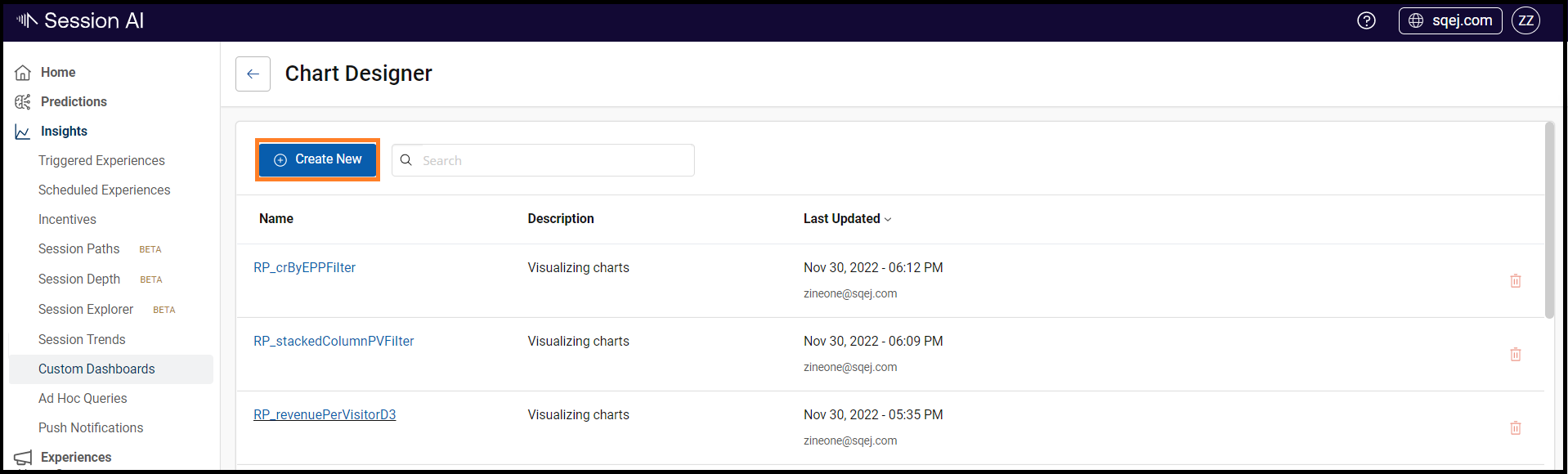
The Chart Designer screen displays all the existing charts.
- Click Create New.
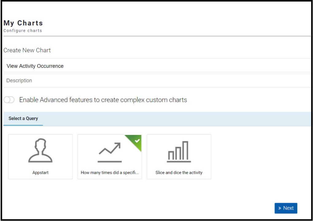
The My Charts screen appears.
- On the My Charts screen, enter the following:
- Chart Name: Enter the name of the chart.
- Description: Enter the description of the chart.
- Enable Advanced feature to create complex custom charts: Skip this option to use the chart designer mode.
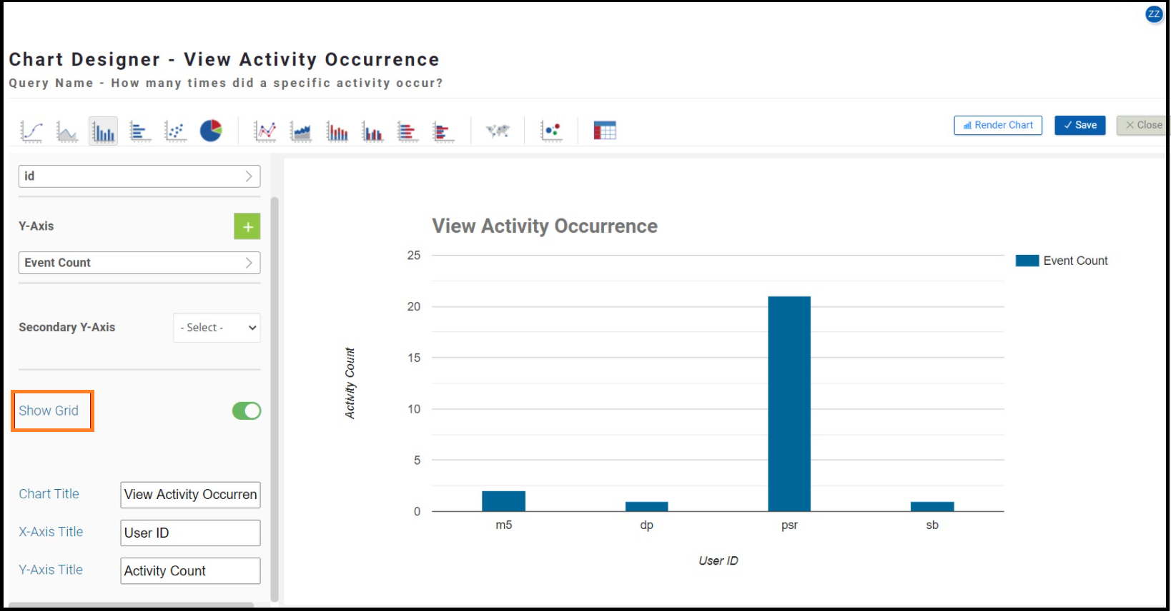
Note: In the below example, you will create a chart to view how many times did a specific activity occur. - Select your query: Select the How many times did a specific activity occur? query.
- Click Next.
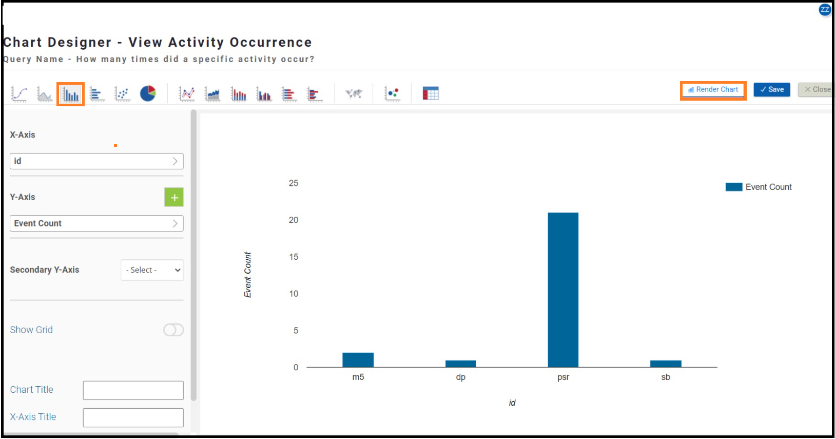
You can further customize the appearance of the chart by selecting the type of chart, such as line charts, pie charts, column charts, etc. Select the X-axis and Y-axis parameters.
Note: In this example, the chart type is Column Chart, the X-Axis value is ID and the Y-Axis value is Event Count.
- Click Render Chart. The following chart appears and then click Save.
In addition, you can customize the chart's look and feel using the following options:
- Show Grid: Switch on the toggle to display the grids on the chart.
- Chart Title: Enter the desired chart name that will appear on the rendered chart. For example, View Activity Occurrence.
- X-Axis Title: Enter the desired X-Axis name. For example, User ID.
- Y-Axis Title: Enter the desired Y-Axis name. For example, Activity Count.
The chart is saved and appears on the My Charts list while creating a dashboard.
Chart Advanced Mode
- In the Insights menu, click the Custom Dashboard tab.
- In the custom dashboard page, click Chart Designer.
The Chart Designer screen displays all the existing charts. - Click Create Chart.
The My Charts screen appears. - On the My Charts screen, enter the following:
- Chart Name: Enter the name of the chart.
- Description: Enter the description of the chart.
- Enable Advanced feature to create complex custom charts: Switch on the toggle and click Next to copy paste a JSON file into the editor for creating complex datasheets. Click Save.
- Select your query: Skip this option to use the advanced designer mode.
The following is the basic structure of a datasheet:
{
	"axes": [-],
	"control": [-],
	"cube": [-],
	"datapoints": [-],
	"description": " ",
	"properties": {
		"dataFilterOptions": []
	}
}- axes: The data dimensions based on which you want to display the captured data.
- control: The chart control, which describes the chart and its properties that are displayed on the chart.
- cube: The source of the data used by the chart.
- datapoints: The measure of the data that is collected in the cube for the axes.
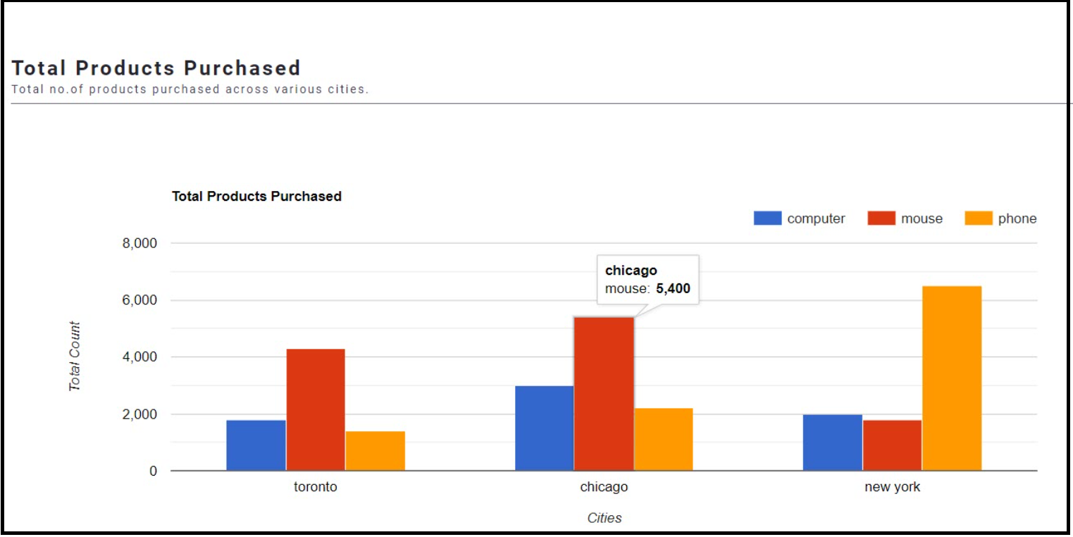
The following is a sample data sheet that displays the total number of products purchased by customers across various cities using data from a cube called ProductsPurchased.
For more information about the ProductsPurchased sample cube, refer to the Create a Data Cube section.
{
    "axes": [
        {
            "id": "city",
            "label": "",
            "props": {},
            "src": "city/*"
        },
        {
            "id": "product",
            "label": "",
            "props": {
                "render": false
            },
            "src": "product/*"
        }
    ],
    "control": {
        "chartType": "ClusteredColumns",
        "props": {
            "title": "Total Products Purchased",
            "vAxis": {
                "title": "Total Count",
                "minValue": 0,
                "textStyle": {
                    "color": "#000000"
                }
            },
            "hAxis": {
                "title": "Cities",
                "minValue": 0,
                "textStyle": {
                    "color": "#000000"
                }
            },
            "legend": {
                "position": "top",
                "alignment": "end",
                "maxLines": 3
            },
            "height": "400",
            "chartArea": {
                "width": "75%"
            }
        }
    },
    "cube": {
        "description": null,
        "id": "cube",
        "ref": "ProductsPurchased",
        "type": "cube",
        "hint": [
            {
                "type": "postprocessor",
                "name": "com.z1.postprocessors.DateFormatterPostProcessor",
                "value": "id=date,read=yyyyMMdd,write=ddMonthPrettyPrint"
            }
        ]
    },
    "dataPoints": [
        {
            "label": "Total Products Purchased",
            "id": "totalProductOrdered",
            "method": "udc.system.aggregation:sum",
            "props": {},
            "src": "totalProductOrdered"
        }
    ],
    "description": "",
    "filters": [],
    "properties": {
        "dateFilterOptions": []
    }
}
The chart is saved and appears on the My Charts list while creating a dashboard.
The following is the rendered chart view of the above datasheet on a dashboard.
Updated about 1 year ago